

Challenges / Pain Points
🛒 Ordering & Payment Flow: Reordering was time-consuming, and the multi-step payment process caused drop-offs.
✅ Clarity & Confidence: Users often felt unsure whether their order was successfully placed.
🌐 Accessibility: Non-Japanese speakers struggled to navigate the app due to limited language options.
Background & Project Goals
This project focused on a mobile app for a popular Japanese sandwich chain. The goal was to improve the ordering experience for both local and non-Japanese-speaking users.
Project Goals:
Simplify the ordering and payment process to reduce friction.
Increase user confidence with clear, intuitive order confirmations.
Enhance accessibility for non-Japanese-speaking users with multi-language support.

Research & Insights
To better understand user needs and inform design decisions, we conducted:
User Interviews: 10 regular customers, including 5 non-Japanese speakers, to uncover ordering difficulties.
Competitive Analysis: Reviewed other food ordering apps in Japan and internationally for usability patterns.
Usability Testing: Observed users navigating the current app to identify confusing flows and language barriers.
Key Insights & Design Implications:
Navigation & Language: Non-Japanese-speaking users struggled with menu categories and item details → Highlighted need for simplified menus and multi-language support.
Order Confirmation: Users were unsure if orders were completed → Emphasized the importance of clear, visual confirmation screens.
Checkout Flow: Multi-step process caused friction and errors → Guided the redesign toward a more streamlined, intuitive flow.
Accessibility: Small text/icons and inconsistent interactions hindered usability → Led to more accessible UI components.
Target Users / Personas

Hiroto Komoto – Time-Constrained Professional
Age: 27
Description: Hiroto is a professional in Tokyo with limited time for lunch. He needs a fast, straightforward ordering process and clear confirmation that his order is successfully placed.
Journey Map


Yui Kazuko – Budget-Conscious Student
Age: 16
Description: Yui is a high school student who often dines alone and has a limited budget. She needs an easy-to-navigate menu, transparent pricing, and clear promotions to make quick and confident choices.
Journey Map


Russell Baker – International Student
Age: 19
Description: Russell is an international student in Tokyo who struggles with Japanese. He needs an app that supports multiple languages and helps him place orders quickly and communicate clearly with restaurants.
Journey Map

Design Solutions
Based on the research findings, we implemented the following solutions to improve the ordering experience:
💳 Streamlined Checkout Flow: Reduced steps in the payment process, allowing users to complete orders faster with fewer errors.
✅ Clear Order Confirmation: Introduced visual confirmation screens showing order details, estimated pickup time, and payment status to boost user confidence.
🌐 Multi-Language Support: Added English and other language options for menus, item descriptions, and checkout instructions.
♿ Accessibility Enhancements: Improved text size, contrast, and button sizes; ensured consistent interaction patterns across screens for better usability.
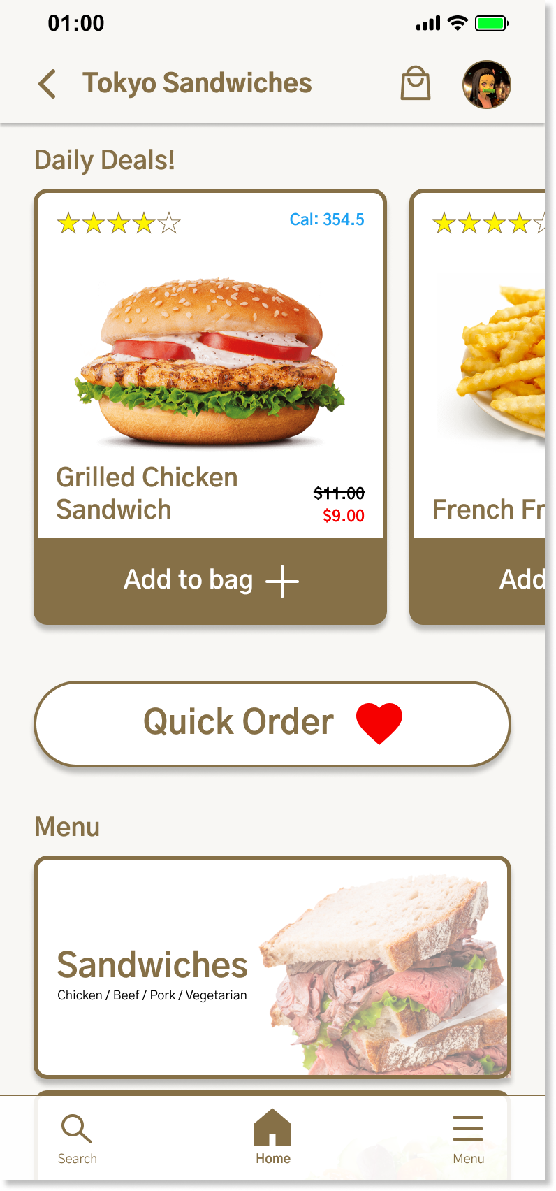

Streamlined Checkout Flow
Reduced steps in the payment process, allowing users to complete orders faster with fewer errors.
Introduced Quick Order, enabling users to save favorite combos (e.g., sandwich + drink + side) for one-click reordering.
Added Express Checkout, allowing logged-in users with saved payment details to place orders instantly.
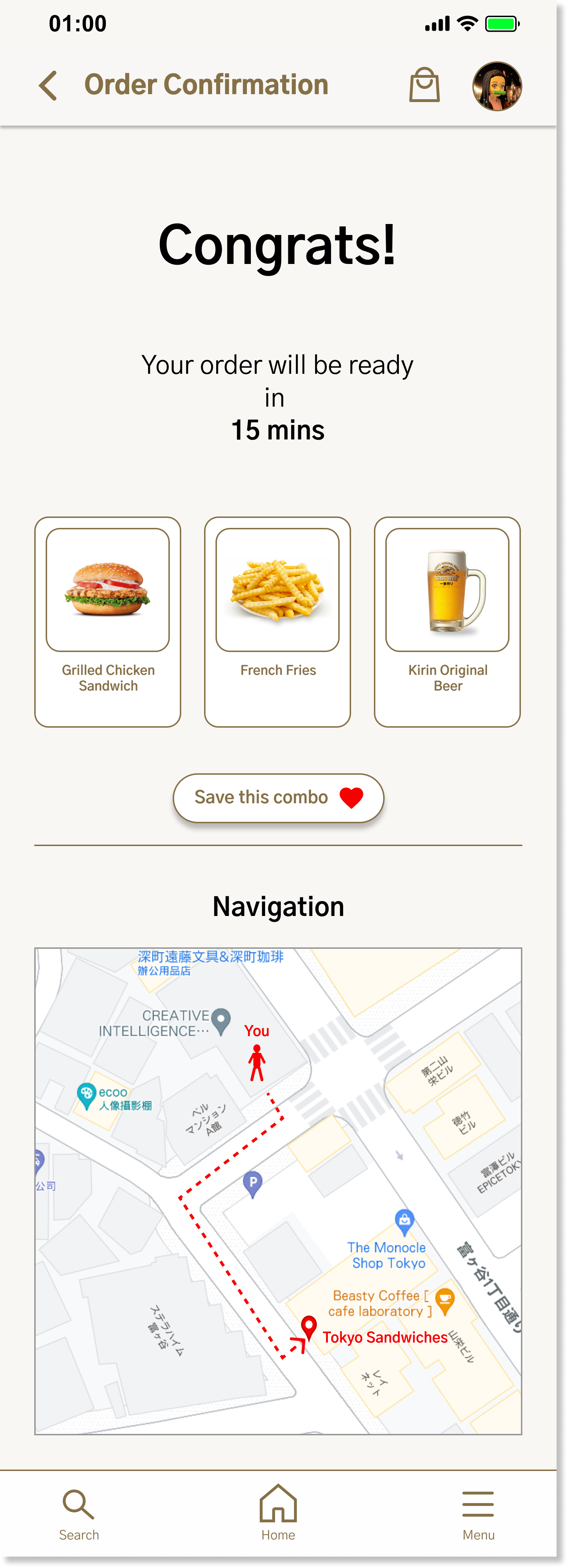
Clear Order Confirmation
Designed a confirmation page with order details shown alongside images, helping users quickly verify their selections.
Displayed estimated pickup time to set clear expectations.
Integrated a map of the pickup location, reducing confusion and ensuring users know exactly where to go.

Multi-Language Support
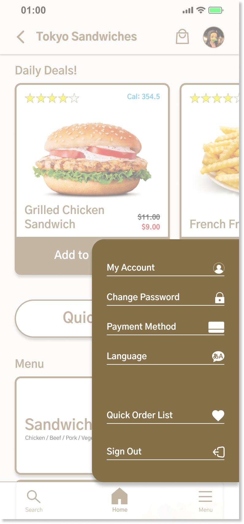
Added a language selection option directly in the menu, allowing users to switch between Japanese and English.
Ensured menu items, descriptions, and checkout instructions are available in multiple languages, reducing confusion for non-Japanese speakers.

Redesigned the end-to-end ordering flow to reduce checkout steps and improve clarity.
Impact
Quick Order and Express Checkout reduced average checkout time from 2.8 minutes to 1.6 minutes (-42.8%), while decreasing payment input errors by 18.7%.
Clear order confirmation with images, pickup time, and location map lowered order mistakes by 23.4% during usability testing.
Multi-language menu improved accessibility, enabling 88.6% of international users to complete their orders successfully without staff assistance (compared to 61.2% before).